%20--%3e%3csvg%20version='1.1'%20xmlns='http://www.w3.org/2000/svg'%20x='0px'%20y='0px'%20viewBox='0%200%20207.3%2029'%20style='enable-background:new%200%200%20207.3%2029;'%20xml:space='preserve'%3e%3cstyle%20type='text/css'%3e%20.st0{fill:%231E293B;}%20.st1{fill:%232563eb;}%20%3c/style%3e%3cg%20id='Ebene_1'%3e%3cg%20id='Ebene_2_00000023959154727838081460000010218683892316788135_'%3e%3cg%3e%3cg%3e%3cpath%20class='st0'%20d='M24.3,7.4c0-0.8,0-1.5,0-2.2c0-0.6-0.4-1-1-1c-4.4,0-7.6-1.2-10.4-3.9c-0.4-0.3-1-0.3-1.5,0%20C8.7,2.9,5.4,4.1,1.1,4.1c-0.6,0-1,0.5-1,1c0,0.7,0,1.5,0,2.2c-0.2,7.4-0.4,17.3,11.8,21.6l0.3,0.1l0.3-0.1%20C24.6,24.6,24.4,14.7,24.3,7.4z%20M11.4,17.5C11.4,17.5,11.3,17.5,11.4,17.5c-0.3,0.2-0.5,0.3-0.8,0.3l0,0c-0.3,0-0.5-0.2-0.7-0.3%20l-2.7-3c-0.3-0.3-0.3-0.9,0.1-1.1L7.5,13c0.3-0.3,0.9-0.3,1.1,0.1l1.4,1.6c0.3,0.3,0.8,0.3,1.1,0.1l4.4-4.2%20c0.3-0.3,0.9-0.3,1.1,0l0.3,0.3c0.3,0.3,0.3,0.9,0,1.1L11.4,17.5z'/%3e%3c/g%3e%3c/g%3e%3c/g%3e%3c/g%3e%3cg%20id='Ebene_2'%3e%3cg%3e%3cpath%20class='st1'%20d='M46.3,8.6h-5.1v14.1h-2.8V8.6h-5.1V6.2h13V8.6z'/%3e%3cpath%20class='st1'%20d='M54.3,16.2h-3.2v6.3h-2.8V6.2h5.8c1.9,0,3.3,0.4,4.4,1.3S60,9.6,60,11.2c0,1.1-0.3,2-0.8,2.8%20c-0.5,0.7-1.3,1.3-2.2,1.7l3.7,6.8v0.2h-3L54.3,16.2z%20M51.1,13.9H54c1,0,1.7-0.2,2.2-0.7s0.8-1.1,0.8-2s-0.2-1.5-0.8-2%20C55.7,8.7,55,8.5,54,8.5h-3v5.4H51.1z'/%3e%3cpath%20class='st1'%20d='M74.3,6.2v10.9c0,1.7-0.6,3.1-1.7,4.1s-2.6,1.5-4.4,1.5c-1.9,0-3.4-0.5-4.5-1.5c-1.1-1-1.6-2.3-1.6-4.1V6.2%20h2.8v10.9c0,1.1,0.3,1.9,0.8,2.5c0.5,0.6,1.4,0.9,2.5,0.9c2.2,0,3.3-1.1,3.3-3.5V6.2H74.3z'/%3e%3cpath%20class='st1'%20d='M85.7,18.3c0-0.7-0.2-1.3-0.8-1.7c-0.5-0.4-1.4-0.8-2.7-1.2c-1.3-0.4-2.4-0.8-3.1-1.3%20c-1.5-0.9-2.2-2.2-2.2-3.7c0-1.3,0.5-2.4,1.6-3.3s2.5-1.3,4.2-1.3c1.1,0,2.2,0.2,3,0.6c0.8,0.4,1.6,1,2.1,1.8s0.8,1.6,0.8,2.6%20h-2.8c0-0.9-0.3-1.5-0.8-2s-1.3-0.7-2.3-0.7c-0.9,0-1.7,0.2-2.2,0.6s-0.8,1-0.8,1.7c0,0.6,0.3,1.1,0.8,1.5s1.5,0.8,2.7,1.2%20c1.2,0.4,2.3,0.8,3.1,1.3c0.8,0.5,1.3,1,1.7,1.7c0.4,0.6,0.5,1.4,0.5,2.2c0,1.4-0.5,2.5-1.6,3.2c-1,0.8-2.5,1.2-4.2,1.2%20c-1.2,0-2.3-0.2-3.3-0.7c-1-0.4-1.8-1-2.3-1.8s-0.8-1.7-0.8-2.7h2.8c0,0.9,0.3,1.6,0.9,2.2c0.6,0.6,1.5,0.8,2.6,0.8%20c1,0,1.7-0.2,2.2-0.6C85.4,19.5,85.7,19,85.7,18.3z'/%3e%3cpath%20class='st1'%20d='M102.6,8.6h-5.1v14.1h-2.8V8.6h-5.1V6.2h13V8.6z'/%3e%3cpath%20class='st0'%20d='M117,17.2c-0.2,1.7-0.8,3.1-1.9,4.1s-2.6,1.5-4.5,1.5c-1.3,0-2.4-0.3-3.4-0.9c-1-0.6-1.8-1.5-2.3-2.6%20c-0.5-1.1-0.8-2.5-0.8-4v-1.5c0-1.5,0.3-2.9,0.8-4.1s1.3-2.1,2.3-2.7s2.2-0.9,3.5-0.9c1.8,0,3.3,0.5,4.4,1.5s1.7,2.4,1.9,4.1h-2.8%20c-0.1-1.2-0.5-2-1-2.5c-0.6-0.5-1.4-0.8-2.4-0.8c-1.2,0-2.2,0.5-2.8,1.4c-0.7,0.9-1,2.2-1,4v1.5c0,1.8,0.3,3.1,0.9,4.1%20s1.6,1.4,2.8,1.4c1.1,0,1.9-0.2,2.5-0.8c0.6-0.5,0.9-1.3,1.1-2.5L117,17.2L117,17.2z'/%3e%3cpath%20class='st0'%20d='M128.5,18.8h-6.4l-1.3,3.8h-2.9l6.2-16.4h2.6l6.2,16.4h-3L128.5,18.8z%20M122.9,16.5h4.7l-2.4-6.8L122.9,16.5z'%20/%3e%3cpath%20class='st0'%20d='M137.2,16.5v6.1h-2.8V6.2h6.3c1.8,0,3.3,0.5,4.3,1.4c1.1,1,1.6,2.2,1.6,3.8c0,1.6-0.5,2.9-1.6,3.7%20c-1.1,0.8-2.5,1.3-4.4,1.3C140.6,16.4,137.2,16.4,137.2,16.5z%20M137.2,14.2h3.4c1,0,1.8-0.2,2.3-0.7s0.8-1.2,0.8-2.1%20s-0.3-1.6-0.8-2.1s-1.3-0.8-2.2-0.8h-3.5C137.2,8.6,137.2,14.2,137.2,14.2z'/%3e%3cpath%20class='st0'%20d='M160.7,8.6h-5.1v14.1h-2.8V8.6h-5.1V6.2h13V8.6L160.7,8.6z'/%3e%3cpath%20class='st0'%20d='M175.1,17.2c-0.2,1.7-0.8,3.1-1.9,4.1c-1.1,1-2.6,1.5-4.5,1.5c-1.3,0-2.4-0.3-3.4-0.9c-1-0.6-1.8-1.5-2.3-2.6%20c-0.5-1.1-0.8-2.5-0.8-4v-1.5c0-1.5,0.3-2.9,0.8-4.1s1.3-2.1,2.4-2.7c1-0.6,2.2-0.9,3.5-0.9c1.8,0,3.3,0.5,4.4,1.5%20s1.7,2.4,1.9,4.1h-2.8c-0.1-1.2-0.5-2-1-2.5S170,8.4,169,8.4c-1.2,0-2.2,0.5-2.9,1.4s-1,2.2-1,4v1.5c0,1.8,0.3,3.1,0.9,4.1%20c0.6,0.9,1.6,1.4,2.8,1.4c1.1,0,1.9-0.2,2.5-0.8c0.6-0.5,0.9-1.3,1.1-2.5L175.1,17.2L175.1,17.2z'/%3e%3cpath%20class='st0'%20d='M190.4,22.5h-2.8v-7.2h-7.3v7.2h-2.8V6.2h2.8v6.8h7.3V6.2h2.8V22.5z'/%3e%3cpath%20class='st0'%20d='M202.8,18.8h-6.3l-1.3,3.8h-2.9l6.2-16.4h2.6l6.2,16.4h-3L202.8,18.8z%20M197.3,16.5h4.7l-2.4-6.8L197.3,16.5z'%20/%3e%3c/g%3e%3c/g%3e%3c/svg%3e)
'%3e%3crect%20width='32'%20height='24'%20fill='white'/%3e%3cpath%20fill-rule='evenodd'%20clip-rule='evenodd'%20d='M0%200V24H32V0H0Z'%20fill='%232E42A5'/%3e%3cmask%20id='mask0_270_67386'%20style='mask-type:luminance'%20maskUnits='userSpaceOnUse'%20x='0'%20y='0'%20width='32'%20height='24'%3e%3cpath%20fill-rule='evenodd'%20clip-rule='evenodd'%20d='M0%200V24H32V0H0Z'%20fill='white'/%3e%3c/mask%3e%3cg%20mask='url(%23mask0_270_67386)'%3e%3cpath%20d='M-3.56323%2022.2854L3.47846%2025.2635L32.1597%203.23787L35.874%20-1.18761L28.344%20-2.18297L16.6456%207.3085L7.22956%2013.7035L-3.56323%2022.2854Z'%20fill='white'/%3e%3cpath%20d='M-2.59924%2024.3719L0.988173%2026.1001L34.5402%20-1.59881H29.5031L-2.59924%2024.3719Z'%20fill='%23F50100'/%3e%3cpath%20d='M35.5631%2022.2854L28.5214%2025.2635L-0.159817%203.23787L-3.87415%20-1.18761L3.65593%20-2.18297L15.3543%207.3085L24.7703%2013.7035L35.5631%2022.2854Z'%20fill='white'/%3e%3cpath%20d='M35.3229%2023.7829L31.7355%2025.5111L17.4487%2013.6518L13.2129%2012.3267L-4.23151%20-1.17246H0.805637L18.2403%2012.0063L22.8713%2013.5952L35.3229%2023.7829Z'%20fill='%23F50100'/%3e%3cmask%20id='path-7-inside-1_270_67386'%20fill='white'%3e%3cpath%20fill-rule='evenodd'%20clip-rule='evenodd'%20d='M19.7777%20-2H12.2222V8H-1.97253V16H12.2222V26H19.7777V16H34.0275V8H19.7777V-2Z'/%3e%3c/mask%3e%3cpath%20fill-rule='evenodd'%20clip-rule='evenodd'%20d='M19.7777%20-2H12.2222V8H-1.97253V16H12.2222V26H19.7777V16H34.0275V8H19.7777V-2Z'%20fill='%23F50100'/%3e%3cpath%20d='M12.2222%20-2V-4H10.2222V-2H12.2222ZM19.7777%20-2H21.7777V-4H19.7777V-2ZM12.2222%208V10H14.2222V8H12.2222ZM-1.97253%208V6H-3.97253V8H-1.97253ZM-1.97253%2016H-3.97253V18H-1.97253V16ZM12.2222%2016H14.2222V14H12.2222V16ZM12.2222%2026H10.2222V28H12.2222V26ZM19.7777%2026V28H21.7777V26H19.7777ZM19.7777%2016V14H17.7777V16H19.7777ZM34.0275%2016V18H36.0275V16H34.0275ZM34.0275%208H36.0275V6H34.0275V8ZM19.7777%208H17.7777V10H19.7777V8ZM12.2222%200H19.7777V-4H12.2222V0ZM14.2222%208V-2H10.2222V8H14.2222ZM-1.97253%2010H12.2222V6H-1.97253V10ZM0.0274658%2016V8H-3.97253V16H0.0274658ZM12.2222%2014H-1.97253V18H12.2222V14ZM14.2222%2026V16H10.2222V26H14.2222ZM19.7777%2024H12.2222V28H19.7777V24ZM17.7777%2016V26H21.7777V16H17.7777ZM34.0275%2014H19.7777V18H34.0275V14ZM32.0275%208V16H36.0275V8H32.0275ZM19.7777%2010H34.0275V6H19.7777V10ZM17.7777%20-2V8H21.7777V-2H17.7777Z'%20fill='white'%20mask='url(%23path-7-inside-1_270_67386)'/%3e%3c/g%3e%3c/g%3e%3cdefs%3e%3cclipPath%20id='clip0_270_67386'%3e%3crect%20width='32'%20height='24'%20fill='white'/%3e%3c/clipPath%3e%3c/defs%3e%3c/svg%3e)
'%3e%3crect%20width='32'%20height='24'%20fill='white'/%3e%3cpath%20fill-rule='evenodd'%20clip-rule='evenodd'%20d='M0%2016H32V24H0V16Z'%20fill='%23FFD018'/%3e%3cpath%20fill-rule='evenodd'%20clip-rule='evenodd'%20d='M0%208H32V16H0V8Z'%20fill='%23E31D1C'/%3e%3cpath%20fill-rule='evenodd'%20clip-rule='evenodd'%20d='M0%200H32V8H0V0Z'%20fill='%23272727'/%3e%3c/g%3e%3cdefs%3e%3cclipPath%20id='clip0_270_67353'%3e%3crect%20width='32'%20height='24'%20fill='white'/%3e%3c/clipPath%3e%3c/defs%3e%3c/svg%3e)
'%3e%3crect%20width='32'%20height='24'%20fill='white'/%3e%3cpath%20fill-rule='evenodd'%20clip-rule='evenodd'%20d='M22%200H32V24H22V0Z'%20fill='%23F50100'/%3e%3cpath%20fill-rule='evenodd'%20clip-rule='evenodd'%20d='M0%200H12V24H0V0Z'%20fill='%232E42A5'/%3e%3cpath%20fill-rule='evenodd'%20clip-rule='evenodd'%20d='M10%200H22V24H10V0Z'%20fill='%23F7FCFF'/%3e%3c/g%3e%3cdefs%3e%3cclipPath%20id='clip0_270_67361'%3e%3crect%20width='32'%20height='24'%20fill='white'/%3e%3c/clipPath%3e%3c/defs%3e%3c/svg%3e)
Introduction
Around one in four adults in the EU lives with some form of disability. For many of them, the question of whether they can use your website is not a minor inconvenience — it is the difference between completing a task independently or not at all.
Accessibility has also become a legal baseline. The European Accessibility Act (EAA) applies to a wide range of digital products and services from June 2025. But even for teams not yet subject to regulation, the practical case is hard to dispute: better structure, better SEO, broader reach, and fewer frustrated users.
This guide covers what website accessibility means in practice — five specific barriers your site may already have, how the WCAG 2.2 framework maps to real decisions, and a checklist you can use to prioritize the work.
Five barriers your website may already be creating
The majority of accessibility problems on the web fall into a short list of recurring patterns. These are the five barriers that exclude the largest number of users.
1. Text that is difficult or impossible to read
Low contrast, small font sizes, and overly complex language compound each other. A user with moderate visual impairment may be able to cope with one of these problems — rarely all three.
The practical baseline: body text should render at 15–16 px minimum, with a contrast ratio of at least 4.5:1 against its background (the WCAG AA threshold). For large text (18 px or bold 14 px and above), the threshold drops to 3:1. Tools like WebAIM’s contrast checker let you verify any colour pair in seconds.
Plain language is harder to test automatically, but it matters significantly for users with cognitive disabilities or lower literacy. Short sentences, active voice, and avoiding unexplained jargon all help.
2. Images with no text alternative
A user running a screen reader encounters an image and hears nothing — or worse, a raw file name like img_20240312_banner_v3.jpg read aloud verbatim.
The fix is alt text: a short, accurate description of what the image shows and, where relevant, what it communicates. Decorative images that add no meaning should carry an empty alt="" attribute so screen readers skip them entirely. Images of text are a particular problem — the text content should appear in the document itself rather than be embedded in a graphic.
This is one of the fastest fixes in accessibility and one of the most consistently overlooked. Every image on your site should either have descriptive alt text or be explicitly marked decorative.
3. Video and audio with no captions or transcripts
A user who is deaf or hard of hearing cannot access audio-only content. A user with cognitive or attention difficulties may process a written transcript far more effectively than audio narration. Captions — synchronised text that appears during video playback — address the first group. Full transcripts available separately address both.
For marketing content, product demos, and webinars, captions are now broadly expected. Automated captioning is available in most video hosting platforms and has improved substantially, but auto-generated captions for technical terms and product names still require review before publishing.
4. Keyboard traps and inaccessible navigation
Not all users interact with a website using a mouse. Users with motor impairments, screen reader users, and keyboard-preference users all navigate via Tab, Enter, and arrow keys. A site operable only with a pointer device excludes a significant portion of that group.
Keyboard accessibility has concrete requirements: every interactive element — links, buttons, form fields, dropdowns, dialogs — must be reachable via Tab; the current focus position must be visually indicated at all times; modals must not create traps; and the focus order must follow a logical sequence that matches the visual layout.
Testing this requires five minutes and no tools: put your mouse aside and navigate your site using only Tab, Shift+Tab, Enter, and arrow keys. If you get stuck, cannot see where you are, or cannot activate elements, you have keyboard accessibility issues.
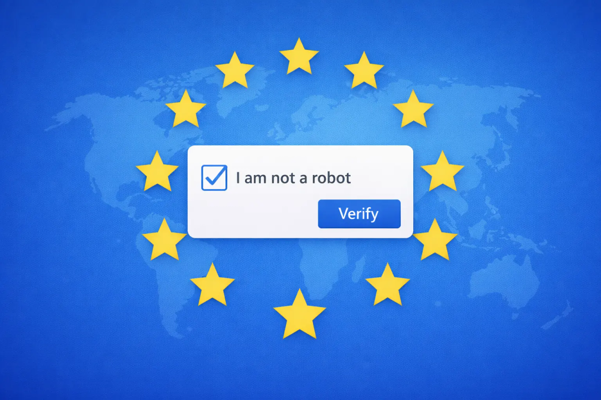
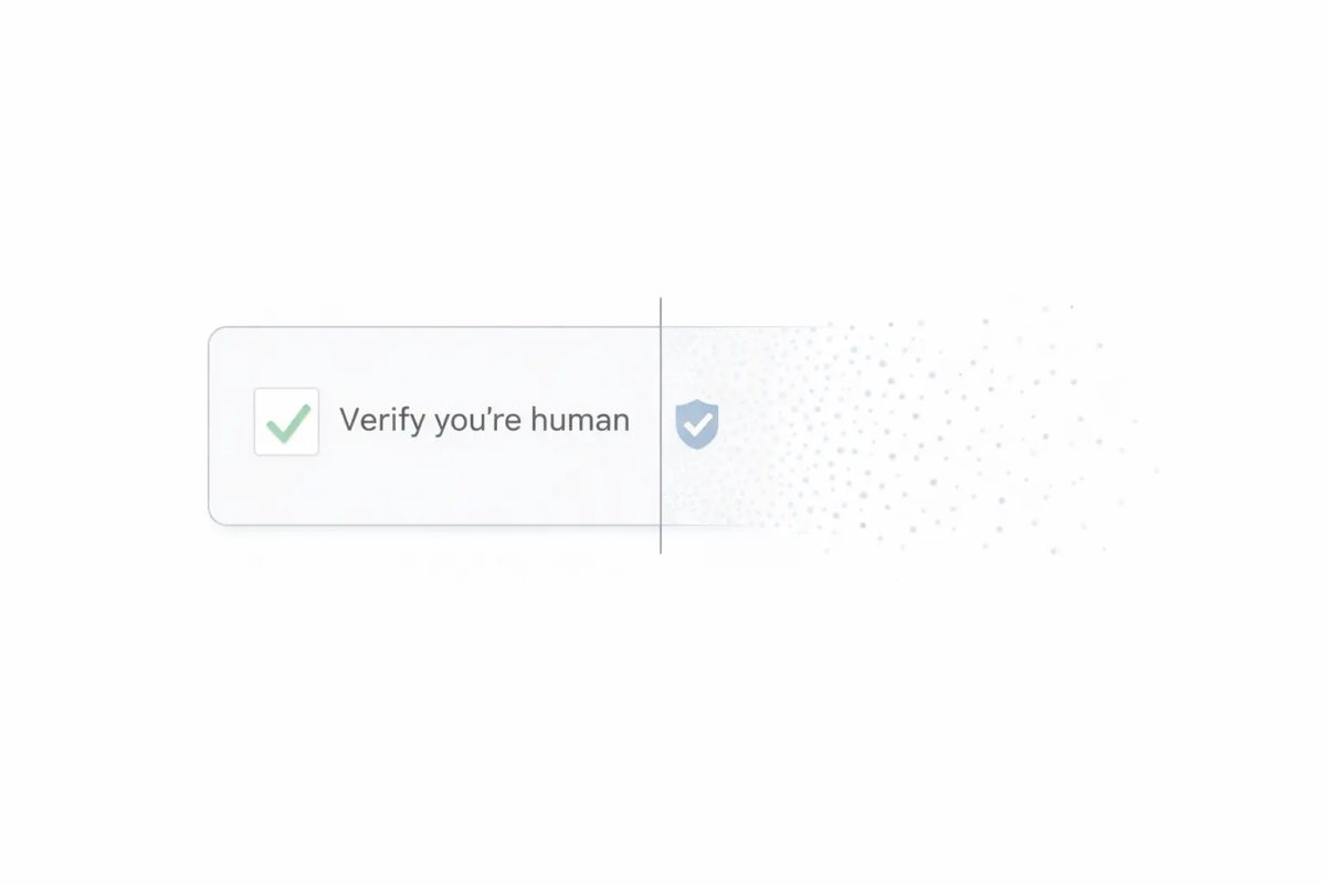
5. Forms and CAPTCHAs that create insurmountable barriers
Forms are where the stakes of accessibility are highest. Contact pages, login flows, registration screens, and checkout pages are functional — a user who cannot complete a form cannot achieve the goal they came for.
Traditional image-based CAPTCHAs are among the most documented accessibility problems in web design. Identifying distorted letters or selecting images containing specific objects is explicitly problematic for users with visual impairments, users with cognitive disabilities, and screen reader users. Audio alternatives help — but they present their own difficulties for users with hearing impairments, and the audio versions of widely-used CAPTCHAs are frequently difficult even for users without impairments.
WCAG 2.2 addresses this directly. Success Criterion 3.3.8 (Accessible Authentication) explicitly requires that authentication processes do not rely solely on cognitive function tests — a category that includes puzzle-solving CAPTCHAs.
The practical solution is to move away from challenge-based CAPTCHAs entirely. TrustCaptcha runs bot detection invisibly in the background while a user fills in a form — no puzzle to solve, no image to interpret, nothing to click. Verification runs during normal interaction, so it does not interrupt the form flow for any user. This approach aligns with WCAG 2.2 SC 3.3.8 and removes one of the most common active barriers from the flows where users most need to succeed.
What WCAG 2.2 actually requires
The Web Content Accessibility Guidelines (WCAG) are the international standard for web content accessibility. Published by the W3C, they form the basis for most national and EU-level legal accessibility requirements. The current version is WCAG 2.2, published in October 2023.
WCAG is organized around four principles: content must be Perceivable, Operable, Understandable, and Robust — often written as POUR. Each principle breaks into guidelines, which break into testable success criteria.
The conformance levels determine what “compliant” means in practice:
- Level A — the minimum. Failing Level A criteria creates serious barriers for assistive technology users.
- Level AA — the legal target for most jurisdictions, including EU accessibility requirements. This is what “WCAG compliance” typically means.
- Level AAA — the highest level, not required by law and often impractical for entire sites, but achievable for specific high-priority components.
WCAG 2.2 added nine new success criteria compared to WCAG 2.1. The most significant additions cover focus appearance (making keyboard focus states more visible), accessible authentication (directly affecting how CAPTCHAs and login flows are designed), and drag-and-drop interaction alternatives. WCAG 2.2 is backwards compatible — meeting 2.2 AA automatically satisfies all 2.1 AA criteria, with one removed exception (4.1.1 Parsing, deprecated in 2.2).
For most business websites, achieving WCAG 2.2 Level AA is the appropriate and legally relevant goal.
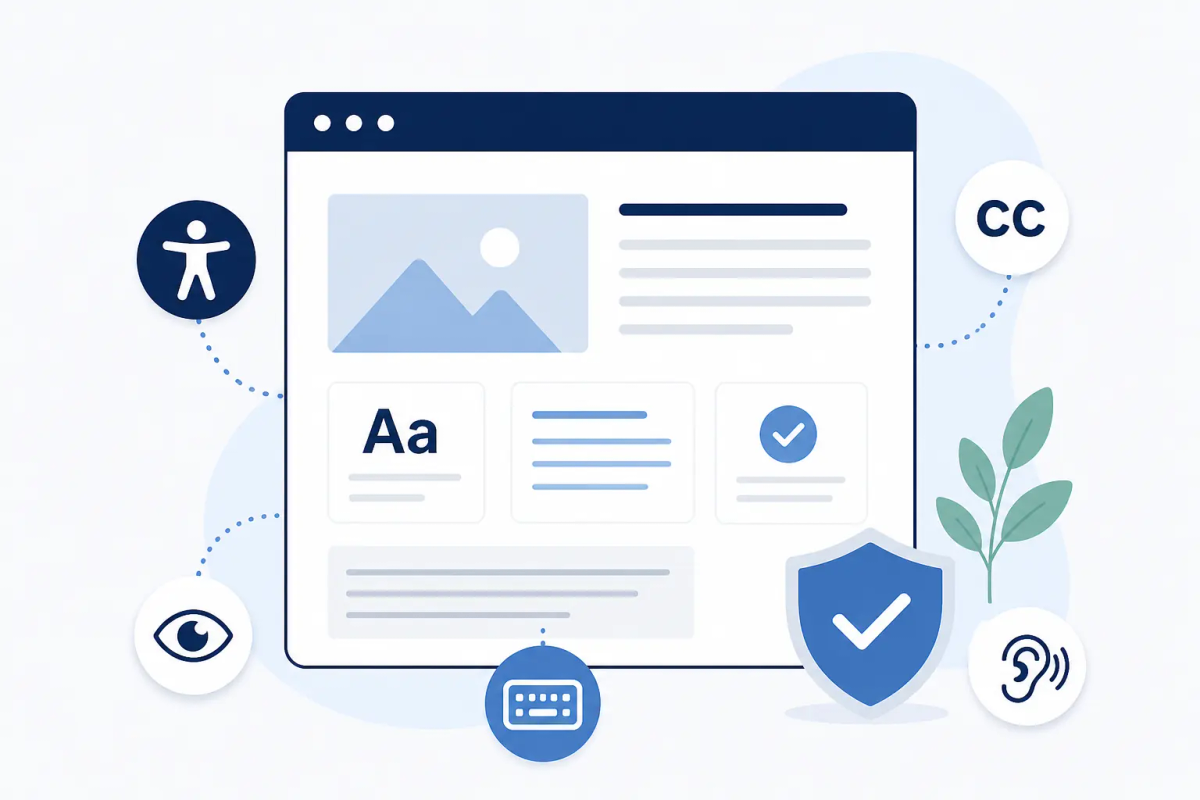
An accessibility checklist you can use today
This is a practical starting point organized by area, not an exhaustive audit. Work through it from the top.
Text and visual presentation
- Body text renders at 15 px or larger
- Contrast ratio is at least 4.5:1 for body text, 3:1 for large text
- Text can be resized to 200% in the browser without loss of content or function
- No content is presented as text inside an image (except logos and decorative graphics)
- Language and reading level is appropriate for your target audience
Images and media
- Every meaningful image has accurate
alttext - Decorative images carry
alt="" - Videos have accurate, synchronized captions
- Audio-only content has a written transcript
Keyboard and navigation
- All interactive elements are reachable and operable via keyboard alone
- Focus indicator is clearly visible at all times
- No keyboard traps exist in modals, dialogs, or custom components
- A skip navigation link appears at the top of each page
- Tab order matches the visual reading sequence
Forms and authentication
- Form labels are programmatically associated with their inputs via
for/idoraria-labelledby - Error messages identify which field failed and explain how to correct it
- No enforced time limits on form completion unless adjustable
- No CAPTCHA that requires solving an image puzzle or an audio challenge
- Authentication flows do not require cognitive function tests (WCAG 2.2 SC 3.3.8)
Structure and semantics
- Headings follow a logical hierarchy without skipped levels
- Landmark regions are used (header, nav, main, footer)
- Each page has a descriptive and unique
<title>element - Links use descriptive anchor text, not “click here” or “read more”
- Tables define headers with
<th>and appropriatescopeattributes
How to prioritize if you are starting from zero
A full accessibility audit of a mature site can return hundreds of issues. The most effective approach when starting without prior accessibility work is to sequence the effort by impact and effort rather than trying to resolve everything at once.
First two weeks: Fix the highest-impact, lowest-effort items. This almost always means image alt text, contrast failures, and missing form label associations. Run your site through Lighthouse (built into Chrome DevTools) or the WAVE browser extension and resolve everything flagged as an error — not a warning, an error. These are automated catches that represent hard failures.
Next month: Address keyboard navigation and focus management. This requires manual testing and often involves working with a developer on interactive components — modals, dropdowns, custom form controls — that automated tools evaluate incompletely. Replace any puzzle-based CAPTCHA during this phase; it is a high-impact change with straightforward technical implementation.
Ongoing: Structural and content accessibility — heading hierarchy, reading level, captions on new video content — becomes part of your production process rather than a one-time remediation effort.
Getting to a WCAG 2.2 AA baseline for a typical business website takes two to four weeks of focused development work, more for sites with complex interactive components or large content archives.
Conclusion
Accessibility is not a one-time audit or a compliance checkbox. It is a continuous quality standard — and the bar set by WCAG 2.2 Level AA is both achievable and increasingly expected. The five barriers described here account for the vast majority of the problems that exclude users from functioning websites. Most of them are faster to fix than teams expect.
One of the fastest improvements you can make to form accessibility is replacing a puzzle-based CAPTCHA with a solution designed for invisible, barrier-free verification. 👉 Try TrustCaptcha free — WCAG 2.2 aligned, EU hosting included on every plan.